Monday, August 29, 2016

Finding The Pursuit of HAPPYness
The phrase, a picture is worth a thousand words, is a theory to be tested in a movie poster. With little opportunity to give a full and accurate reading of what the movie has to offer, a movie poster must be eye-catching and convincing. The Pursuit of Happyness, already drawing attention with the famous actor Will Smith and son highlighted, accurately depicts the summary of the movie through the simple yet intense showing of contentment between the two characters.
The movie poster shows the father, Chris, and son, Christopher,  holding hands and walking, a direct demonstration of pathos by the moving relationship between the two. They appear to be close, due to the affectionate look that man is using to look at his son and the reliant look the boy has while leaning on his father. Though from the picture we can only reasonably assume that this is his son, the opening scene clarifies the confusion as the son calls him his father. It is not  shown in the picture that the family of two is poor and struggling. But as later verified, the family is infact coping with the loss of a secure home and money. Later scenes find meaning to the title of the film when the name of the daycare the young boy attends, has the  ironic name of Pursuit of Happyness. This is the first example of happiness being found in the simplicity of menial tasks such as walking his son to school.
Throughout the movie there is a common theme of searching where happiness can truly lie. The poster accurately shows that the two find joy in just being with each other. In moments with his son he reminds him “ Don’t ever let someone tell you you can’t do something, not even me.” The placement of the little boy’s head leaning on his dad shows that the little boy relies on his father despite the Chris’s often failures.
The movie poster, being only a picture, lacks to show the inner struggle of both mental capacity and physical battle both Chris and Christopher undertake. Chris often fails until he finally finds his way. The movie title, using the verb to pursue into a noun entailing that it is a journey, is the only insight into the true depth of the film. Chris often questions “they all look so damn happy. Why couldn’t I look like that way?” and making reference to Thomas Jefferson’s life liberty and the pursuit of happiness is not shown in the happy faced man in the cover. The also satirical scene of his “happiness” or machines being stolen by hippies, meant to be relaxed and happy people, often stealing the machines away, is not depicted in the cover.
The bright whiteness of the poster , the usage of the light between the two characters and the placement of the light all factor into the drama-filled movie. The light, representing the final finding of happiness in the end of the film is a clear answer that the pursuit was found successful and the life he led was worth the struggle.
The Pursuit of Happiness, a switch between major triumphs and heartbreaks, can be found in the movie poster. Though the core of the movie is one that requires a full watching, the basis of happiness being found through the struggles of a father and son grabs the attention of any passer-by. An emotional pull draws you to want to watch and find how happiness can really be found.  

Good Will Hunting


            Movie posters tend to represent the main idea of the film and also show the main characters in the movie.  In my opinion, the movie poster for Good Will Hunting does exactly that.  In the picture above we can see one younger man laughing – enjoying himself, and to his left we see an older guy looking on with a look that can be interpreted in many ways.  I view this look as a confused yet prideful gaze.  I immediately think that he’s happy to make the younger man smile and laugh, but at the same time he wants to get more out of the younger man.  Maybe I’m reading into this too much because I’ve seen the movie, but that’s what I get out of the picture.  The main plot of this movie is the exploration of Will Hunting’s (the younger man) life that he chooses to live.  Despite being a genius, he works as a blue collar worker and spends his days drinking and getting into fights.  He’s an orphan who has clearly experienced several traumatic events in his life and has developed a defense mechanism of pushing people away before they can get close to him.  During the movie Will meets a girl who begins to cross his personal boundary into unknown territory while also meeting with a therapist who can get inside his brilliant mind.  Based off the movie poster almost nobody would be able to guess the full plot of this movie, but it does the best possible job to give the movie-goer a brief idea of what the movie could be about.  For genre, I look at the poster and see one man laughing and one man looking very serious.  Due to this, I think it would be a comedic-drama which it actually is.  As for characters, the young man looks joyful in the poster, but we can also see the older man acting as somewhat of a mentor to the younger man.  This perfectly describes their relationship during the film.  There could have been more characters on the poster, but I believe they correctly put the two most influential characters on the cover.  “For the first 20 years of his life, Will Hunting has called the shots.  Now he’s about to meet his match.”  This is the catch phrase used in the movie poster and it gives perfect insight to the picture and to the plot of the entire film.  Will Hunting goes through seven psychologists before going to Sean where he meets a man he can trust and confide in.  If there was one thing wrong with this movie poster, it would be the exclusion of Will Hunting being a genius.  I’m not exactly sure how they would have incorporated that into a movie poster, but looking at the poster gives no indication of how smart the younger man is.  Otherwise, I think this movie poster can do no wrong.  It perfectly entices viewers with a simple yet perplex picture of the relationship between two great men.


Footloose Movie Poster Arguments


     Movie posters can serve as one of the most important ways of advertising. The audience can see a glimpse of what the movie is going to be like. Although some are misleading, the poster for Footloose does not come off that way. In Everything’s an Argument, Andrea Lunsford claims “Images can make especially powerful appeals to our emotions” (Lunsford 389). This statement is accurate when looking at the movie poster for Footloose. This particular movie poster strongly focuses on the audience’s emotion appeals, or pathos. 
     This poster appeals to people’s carefree side, showing the two main characters and several other blurred characters in the background dancing.  It also appeals to one’s desire for intimacy. Through the two characters body language, one can take away that they are romantically involved. After watching the movie, it is easy to see the movie poster accurately depicted the relationship between Kenny Wormald and Julianne Hough’s characters Ren and Ariel. Since these actors are not notably movie stars, they both were posed with an emotional appeal in the poster.
     When looking at the poster, one immediately notices the vibrant purple title and tagline along with two people front and center. The color purple is associated with ambition and purpose. Purple accurately depicts the mood that Wormald’s character Ren has while he tries to get the town he lives in to loosen up and change laws. The main focal point of the movie poster is the two main characters, Wormald and Hough, in a close embrace. Footloose’s storyline heavily revolves around these two and their developing relationship. One of the other main topics in the film has to do with dancing and making the town “cut loose”. The poster reflects this subject very clearly by having an image of the two characters and several other blurred images dancing in the background. They all seem relaxed and like they are having fun. Another indication that the film is about having fun and letting go is the tagline located at the top of the poster, “There comes a time to cut loose”.
     Although it’s possible emotional appeal has more of a role in deciding whether one is in favor of something or not Footloose’s movie poster also uses logos and ethos to entice people (Lunsford 394). The movie poster appeals to one’s logical side by the string of words placed at the bottom. The first line notes that two of the production companies involved were Paramount Pictures and Spyglass Entertainment. Both production companies are very notable with successful movies such as The Wolf of Wall Street, 13 Hours, and The Vow. Julianne Hough’s background with dance may bring an ethical appeal to the movie poster. Hough has starred in several movies and shows that heavily involve dance such as Burlesque and U.S. reality show Dancing With the Stars  (imdb.com).

     Overall the poster correctly portrays the major themes and storyline of the movie. It gives just enough to draw people in and make people want more. After looking at this poster, audiences will definitely be interested in watching the movie. The poster does not have much on it yet accurately depicts what the movie is about and is not misleading in any way.  

Man On Fire by Michael Trenka


Michael A. Trenka

Writing as an Inquiry

Blog 1

Man On Fire

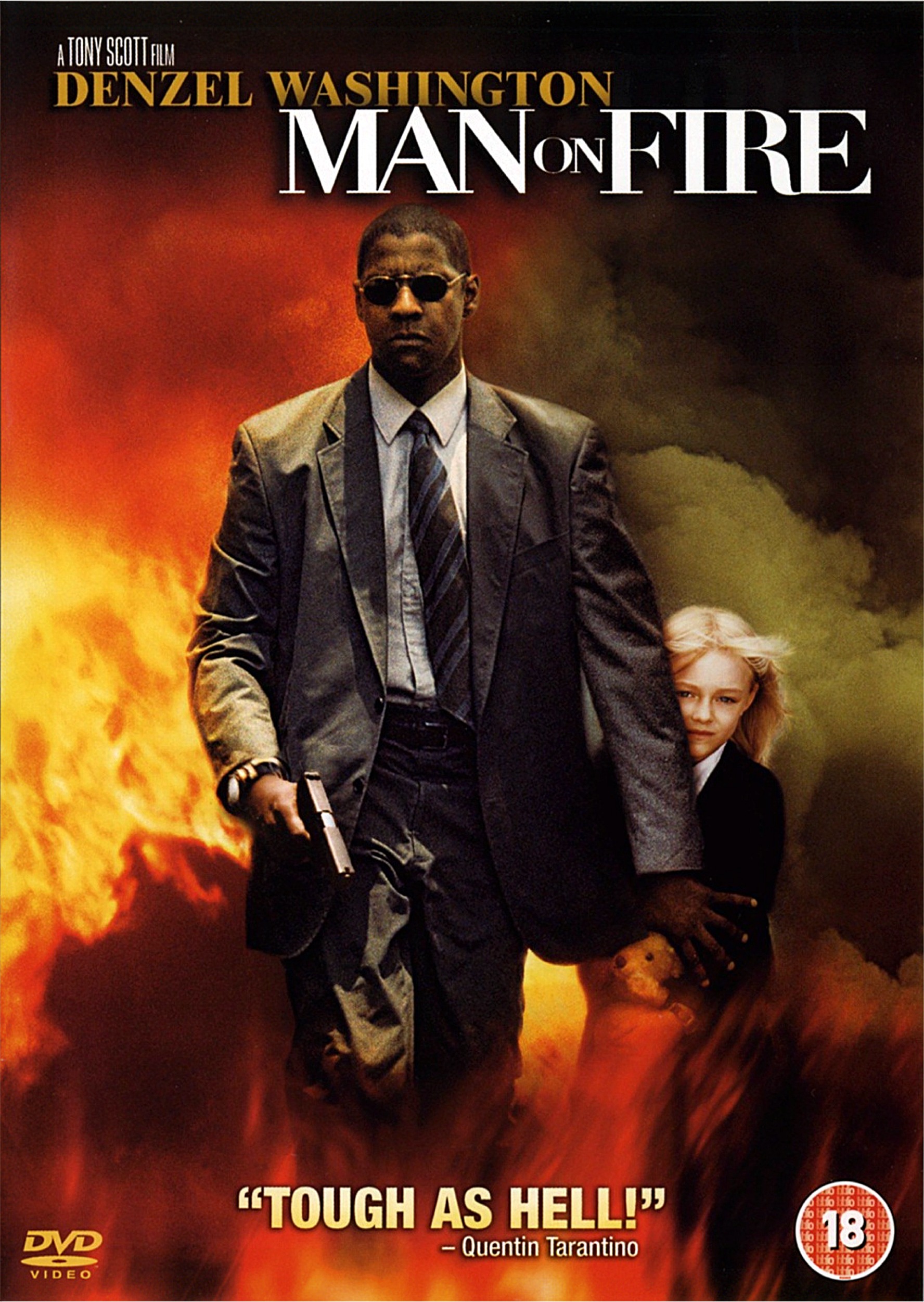
              In just one moment, one can understand how accurately the movie poster depicts the movie Man on Fire.  Man on Fire follows the life story of John Creasy, a troubled former CIA assassin.  When Creasy is hired as a family body guard in Mexico City, he becomes a father figure to the daughter of the family, Pita.  When Pita is kidnapped despite Creasy’s best efforts, a man on fire is born. Creasy uses his prior training to create one hell of an adventure with the sole goal to find Pita and eliminate everyone in his way.  Do to Denzel Washington’s portrayal as a protective figure and the general intensity of the poster, the poster depicts man on fire very accurately. 

                As we take apart the poster and relate it to the movie, a big thing that stands out is Creasy’s left hand over Pita.  This gives the audience knowledge that Creasy is very protective of Pita.  This heavily applies in the film.  The teddy bear is a hidden clue in the poster. In the movie, Pita’s teddy bear is symbol of hope for Creasy as he embarks on his mission.  We also cannot help but notice the gun in Creasy’s right hand.  In the movie, there is a scene where the street has been blocked off by police and Creasy and Pita are stuck in the middle of the street.  As soon as Creasy figures out that they are not police, he does everything in his power to protect Pita, using his gun to take out the Mexican mafia.  The actions taken by Creasy can only lead us to assume his role as a protector.

Making appearances in many movies and starring in his main films, Denzel Washington’s role in the film industry has been portrayed around action packed thrillers.  After seeing the poster to the film, Man On Fire, one can only assume to expect nothing less than an action packed thriller.  At the bottom of the poster we can see the quote “tough as hell”.  This gives us a sense of who Creasy is as a person as well as understanding that the mission he is about to endure, is not going to be easy.  As a viewer we can also see the red flames in the background, choosing the background of explosions immediately initiates a high level of intensity compared to a background of meadows and butterflies.  The artist of the poster decided to give Denzel Washington a look of fierce and determination on his face.  This furthers the theme of intensity carried throughout the movie. 

              All in all, the poster did not leave the viewer misinformed, as it gave interpretation of what kind of movie we are about to watch.  If seen as a timeline, the poster has three parts. The initial view of the loud, intense background comes first. Then, the viewer sees Washington’s character – fierce, determined, and wielding a gun. Finally, Pita, the most innocent looking girl, is seen, held back by Washington’s Gronkowski-like hand. In conclusion, the poster is a master piece.
Image result for man on fire

Step Brothers


Logan Simon
Professor Jackson
Intro Comp
August 29th, 2016

Step Brothers

               Movie posters are almost as important as the movie itself. A movie poster can provide an extra lift to viewers who may currently be on the fence about the movie.  They can capture a person’s attention with color or a unique picture. A great movie poster will give insight on the film, but also great some curiosity. Though it’s nothing exciting and there’s nothing that will really catch somebody’s eye, I still believe the creators of the Step Brothers movie poster did a pretty decent job.

               Looking at the movie poster, it’s pretty obvious the genre is comedy. Though there isn’t much to the poster from a plot standpoint, it portrays the personalities of these men well. Will Ferrell and John C. Reilly, two prominent figures in the comedy world, appear in a typical family picture pose. This particular pose suggests that the brothers are at peace with one another, and everything is okay. Knowing the backgrounds of these two actors, however, should indicate that the pose is satirical. The brothers, or step-brothers, start out as enemies and one even hits the other one with a golf club. Later on, they begin to realize that they’re actually pretty similar and can get along, which gives the pose on the poster some sort of resemblance to the film.

               Going deeper into the movie poster, the light background provides insight that it will be a lighthearted movie. The tag line for the movie is, “They grow up so fast.” This line should be taken as purely sarcastic, like the movie itself, because both of these men have been living at home for over 38 years. The men are captured looking into the distance past the camera which can represent some form of dysfunctionality. However, the most important aspect of the poster are the sweaters that they’re wearing. After watching the film, it’s evident that these guys don’t really fit the stereotype. They love sitting on the couch, watching TV in a t-shirt and boxers all day long. A collared shirt and a sweater is the exact opposite of their normal attire, so featuring this in the poster was a clever move.

The Ethos appeal is covered by using two established figures in the comedy world in this movie. The majority of the films these men had appeared in prior to Step Brothers makes it easy to assume that this will also be a comedy. Both of these men are credible, popular comedians who had an already established reputation prior to this film. For me, I’m a big fan of Will Ferrell’s so that connects me with the Pathos appeal. I will see almost every film Will stars in because it’s a guarantee to make me laugh.

In the end, the movie poster is nothing exciting, but it gets the job done and provides enough hints to leave curiosity to the viewer. Because this movie was such a success, it didn’t really need a movie poster to help convince potential viewers to go see it. Having both Will Ferrell and John C. Reilly in the same movie, and featuring them together on the movie poster, is all the creators needed to do and they accomplished that.
Image result for step brothers movie poster
Isabel Collins
8/29/16

Adventureland

The main reason I chose to watch Adventureland was because of the appealing movie poster. The poster shows the two main actors, Kristin Stewart and Jesse Einsenberg, romantically gazing into each other’s eyes while wearing their matching theme park t-shirts. This appeals to people of a young age because they can relate to the struggles of having a summer job, and the actors who play the part in this movie are fairly young. The story kicks off with Jesse Einsenberg being forced to get a summer job in order to make money to attend Columbia for journalism in the fall. When he arrives at Adventureland, the general pathos of the workers and theme park is dull and monotone, and the impression that only overage losers work there. As his time working progresses, he begins to make friends and a small family with the other workers, and he develops a romantic interest in Kristin Stewart. Jesse explains to her that he just had his heart broken, which is another factor that appeals to a young audience, which he is still getting over. The couple goes through a roller coaster of drama, but in the end they end up getting together officially, winning over the hearts of the viewers. I would say that the film follows the Logos, or structure, of a predictable essay. By this I mean how Jesse’s original love interest and summer job search; the introduction and rising action, comes along with drama; the climax, and ends in the joining of the couple; the resolution.


I think the movie poster does a good job of displaying what the movie is about. Under the title, there is the quote “nothing brings people together like a crappy summer job.” This is a point that hooks viewers in, making them interested in the potential for romance and relate to the “crappy” aspect. In the background, there are the rest of the workers, who are obviously varied in looks. People love movies about misfits coming together and making friends, which is another appealing aspect to the poster. Because the movie’s main scene is in a theme park, the poster is able to draw viewers in with the feeling of summer fun and sunshine. I would say that the poster directly reflects the movie, not as much in how much drama occurs, but in the sense of misfits coming together through their ordinary job. The Ethos of the film is very laid back and 80’s feel; you can instantly tell it is a different era by the restaurants, outfits, buildings, and people. The Ethos is very reflected in the poster, and the bright orange fence color makes it pop. I really liked this film, and I recommend it to anyone who loves romantic comedies that has drama added here and there. For someone of my age, I thought it was really relatable because I work as a camp counselor each summer and I live in a time where everyone is rushing to be in a relationship. The movie poster is one of the main things that chose me to pick this film and they directly relate, which is important in cinema


Bad Boys II Movie Poster Arguments

Bad Boys II Movie Poster Arguments  


Bad Boys II Movie Poster Arguments
Advertisement is a crucial selling point in any business that relies on consumers, and the movie industry is no exception. Movies are known to sell millions of dollars in ticket sales in a single opening weekend, and additional millions in the proceeding weeks. This industry is no stranger to advertisement, and tends to spread their message by way of movie posters as well as previews. Although consumers who possess a little extra spending money are more likely to venture to a location for entertainment, advertising new movies to the public helps the box office sell tickets to a wider range of people.
The movie poster for the movie Bad Boys II is quite simple. The main characters are walking through an arid unknown location, which is predominately filled with drab hues from dark yellow to reddish-brown. First, the eye is drawn to a very dry, lifeless hay-colored ground. It is difficult to decipher the composition, but it appears to be dead grass sprinkled about a powdery, nutrient deprived soil. As the eye ascends from the ground the to the sky, new textures and colors are introduced to the movie poster. The sky transitions from a murky grey-white to a deep grey-blue and is flooded with smoke. Scattered about the upper sides of the poster are dark green palm trees that are engulfed in the blanket of smoky heat. The background colors are very well chosen to pull the potential consumer's eye toward the explosion. As a result of the lack of vibrant colors and the presence of smoke, the background encourages potential consumers associate these colors with seriousness.
The two main characters are the focal point of the movie poster, and are located front and center. Will Smith is located on the right, and Martin Lawrence is located on the left. Both of these actors are famous, but Will Smith is a mega famous actor which automatically draws in his fans. By placing the actors front and center on the movie poster, fans of the actors will already be persuaded to see this movie. Both Lawrence and Smith have visible police badges with appeals to potential consumers’ ethics.
Bad Boys II is classified as a crime film/thriller movie. Although not included on the movie poster, the movie is rated R which draws attention from a certain crowd. Logistically speaking, since the age of admittance into a rated R movie is 17 the likelihood of the movie being serious increases tremendously. From the poster alone, a potential consumer would most likely assume the genre of the movie to be crime because of context clues that are presented in the image. I assumed from the poster that this movie would be serious because there were no context clues implicating otherwise. However shortly into watching what is claimed to be a crime film/thriller, I found myself laughing hysterically. The take away from movie posters is that they show the crowd what they want to see: movie stars and a solidified genre.


Meet the Parents 
Meet the Parents is a comedy that brings to light the fear that all boyfriends feel when first meeting their girlfriend's parents. It is easy to tell that the movie is a comedy for one reason, it was directed by the same director that directed Austin Powers. The poster does a great job on showing what it feels like to be the boyfriend. It depicts the father using a lie detector on his daughter's boyfriend and the emotions both parties feel. Although, in most cases, this might not actually occur, for some boyfriends it might actually feel as if they are hooked up to a lie detector. Most boyfriends are nervous to meet the parents of their significant other due to the pressure of trying to impress them and answering their questions. The poster does a great job in showing the relationship between father and boyfriend.  
In the movie, Greg Focker (the one hooked up to the lie detector) is a male nurse you wants to marry Pamela Byrnes whose father, Jack Byrnes (the man using the lie detector) is a retired CIA agent.  The movie is about a visit that Greg and Pamela decide to take to her parents and staying the weekend at their house for Pamela's sister's wedding. From the beginning of the movie, Greg was already nervous to meet Pamela's father, Jack. Upon meeting Jack, Greg was still feeling some discomfort in regards to impressing his potential father-in-law. Jack is a very serious man and does not mess around with those he does not know. The poster does a great job at illustrating Jack's personality due to his facial expression. Not only does the poster do great job at depicting Jack and his personality, but it does the same for Greg. As depicted in the poster, Greg's face says it all. His eyes are wide open, he has a straight face, and he looks stiff. These are all visual cues showing nervousness and this is exactly how Greg acts throughout the movie. No matter what Greg does, he always messes something up accidentally but that is not how Jack sees it. Jack sees Greg's mistakes as intentional actions used to bring harm of some sort into his life. It seems as if Jack does not trust Greg. 
 The poster also depicts how Jack does not trust Greg at all. One of the first scenes shows Jack asking one of his old CIA buddies to run a background check on Greg. Also, Greg does not trust Jack. When first introduced, Greg was told that Jack was a retired florist but figures out the lie by accidentally

stumbling upon Jack's secret room. This is where Jack finds Greg and asks him if he would like to try the lie detector. That is the first and only scene where Jack actually uses the lie detector on Greg. This poster does a lot with very little. 
It accurately illustrates how the movie goes, and how each of the main characters interact and act with each other and others. The poster itself does not include all important characters but it does a great job at showing what to expect from the two most important characters. Another aspect is that these are the two characters that provide the movie and story with comedy and disputes. This poster does an excellent job at providing an idea of what the movie is about and truly depicting the relationship between these two characters.